STRATEGIC APPROACH

From Brand Strategy to Product System
Packaging is often the most direct expression of a brand. My approach focuses on translating positioning into clear product architecture — balancing identity, hierarchy, and shelf behavior to create scalable and recognizable systems.
I lead packaging design at the system level — aligning brand, product, and consumer understanding into a cohesive structure that supports both differentiation and growth.
VLN Packaging System
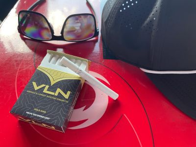
Translating Behavioral and Premium Positioning into a Flexible Product System
The VLN packaging system was originally developed to support a stand-alone premium brand built around behavioral positioning and elevated perception. As market strategy evolved, VLN shifted into a flexible model — functioning both as a premium expression and as a line extension within established retail brands, including Pinnacle VLN and Smoker Friendly VLN.
This required the packaging system to adapt without losing clarity, credibility, or brand meaning.
Strategic Approach
The adaptable packaging framework emphasized:
- A disciplined hierarchy allowing VLN to live both as a premium expression and as a branded line extension
- Clear communication of VLN differentiation within existing retail brand architectures
- Refined visual restraint supporting elevated perception across multiple brand contexts
- Consistent messaging and structural logic to maintain recognition and credibility
This flexible system enabled VLN to scale across brand environments without fragmenting its identity.
Execution Ecosystem
The system was applied across:
- Stand-alone VLN premium packaging exploration
- Pinnacle VLN integration
- Smoker Friendly VLN integration
- Retail shelf communication and product hierarchy
Outcome
- Preserved VLN brand meaning across multiple product architectures
- Enabled scalable integration within retail partner brands
- Maintained clarity and differentiation despite structural shift
- Created a flexible system capable of supporting future brand evolution
My Role
Led the evolution of the VLN packaging system from a stand-alone premium concept to a flexible architecture capable of integrating within established retail brands. Directed hierarchy, messaging, and visual structure to preserve VLN’s behavioral and premium positioning while ensuring clarity, consistency, and scalability across multiple product environments.


SPIKED JUGS / JUG LIFE BEVERAGES
Creating a Disruptive New Format in Beverage Alcohol
Spiked Jugs was developed as a bold next-generation RTD alcohol brand designed around how younger consumers actually drink socially. Built for group occasions, portability, and high-energy experiences, the brand challenges traditional ready-to-drink conventions through oversized format packaging, unapologetic visual identity, and social-first positioning.
Strategic Approach
I led the creative development of the Spiked Jugs brand identity and packaging system, creating a visual language designed to immediately stand out in both retail and social environments. The objective was to develop a brand that felt disruptive, culturally relevant, and instantly recognizable while supporting long-term scalability across flavors, campaigns, and future product extensions.
Brand Development
Creative development included:
- Brand identity and logo design
- Packaging design and flavor system architecture
- Product naming and flavor positioning
- Visual identity development
- Retail and social-first brand presentation
- Investor presentation creative direction
- Consumer-focused storytelling and campaign visuals
The packaging system was intentionally designed to feel loud, bold, and unmistakable on shelf—embracing the oversized “jug” format as a core part of the brand personality rather than minimizing it.
System Thinking
The visual architecture emphasized:
- Strong shelf disruption and instant recognition
- Cohesive flavor differentiation across SKUs
- Scalable design systems for future expansion
- Social-media-friendly visual identity
- High-energy consumer appeal aligned with Gen Z drinking culture
My Role
Led the creative direction, logo creation, packaging design, and visual brand system for Spiked Jugs / Jug Life Beverages, developing a disruptive RTD alcohol concept built around large-format social consumption, bold flavor positioning, and culturally driven consumer engagement.
